

Go slower. Get faster. Scientifically proven adaptive training method designed to help you get faster by focusing on zone training.


Role: UI/UX designer
Duration: 2 months
Tools: Figma/Figjam
Platform: Mobile First Web Design
Go slower to get faster?
Most people exercise too hard on their easy days and too easy on their hard days, however, research shows that splitting total exercise volume into 80% “easy” and 20% “hard” (also known as polarized training) results in the greatest increase in fitness gains and is the key to longevity. It is also how all elite athletes train.
Polarized Training

The majority of training is done at low intensity (80%), includes only a small portion at high intensity (20%), and avoids medium intensity.

“I like seeing that fitness number increase, but I feel pretty bad when I ride slow and don't get any PRs - even when I am supposed to be riding slow because of my training plan.”
— User survey quote
Effort > Speed
I realized through my research that the problem is not getting people to workout, it is getting them to slow down. I needed to create a product that encouraged users to manage their effort instead of chasing PRs. I knew the design must prioritize goal adherence, graphic representations of metrics, and an appealing interface that is easy to interpret.
Hey Garmin, Apple, and Strava: More isn’t always better
Despite the popularity of apps from Garmin, Apple, and Strava, they all lack real incentive to manage intensity. In fact, quite the opposite. They all focus on reward systems that focus on and encourage constant improvement. Training for both longevity and competition doesn’t work that way. In fact, Strava’s fitness number will decrease after taking just ONE DAY OFF. Most people understand the importance of rest days for recovery. Apparently Strava’s algorithm doesn’t
From problem to solution
After developing my user personas, I was able to focus on generating creative solutions and design concepts, including creating my site map, user flows, and task flows. These visual tools allowed me to create a clear structure and hierarchy that aligned with the mental models of my target users.


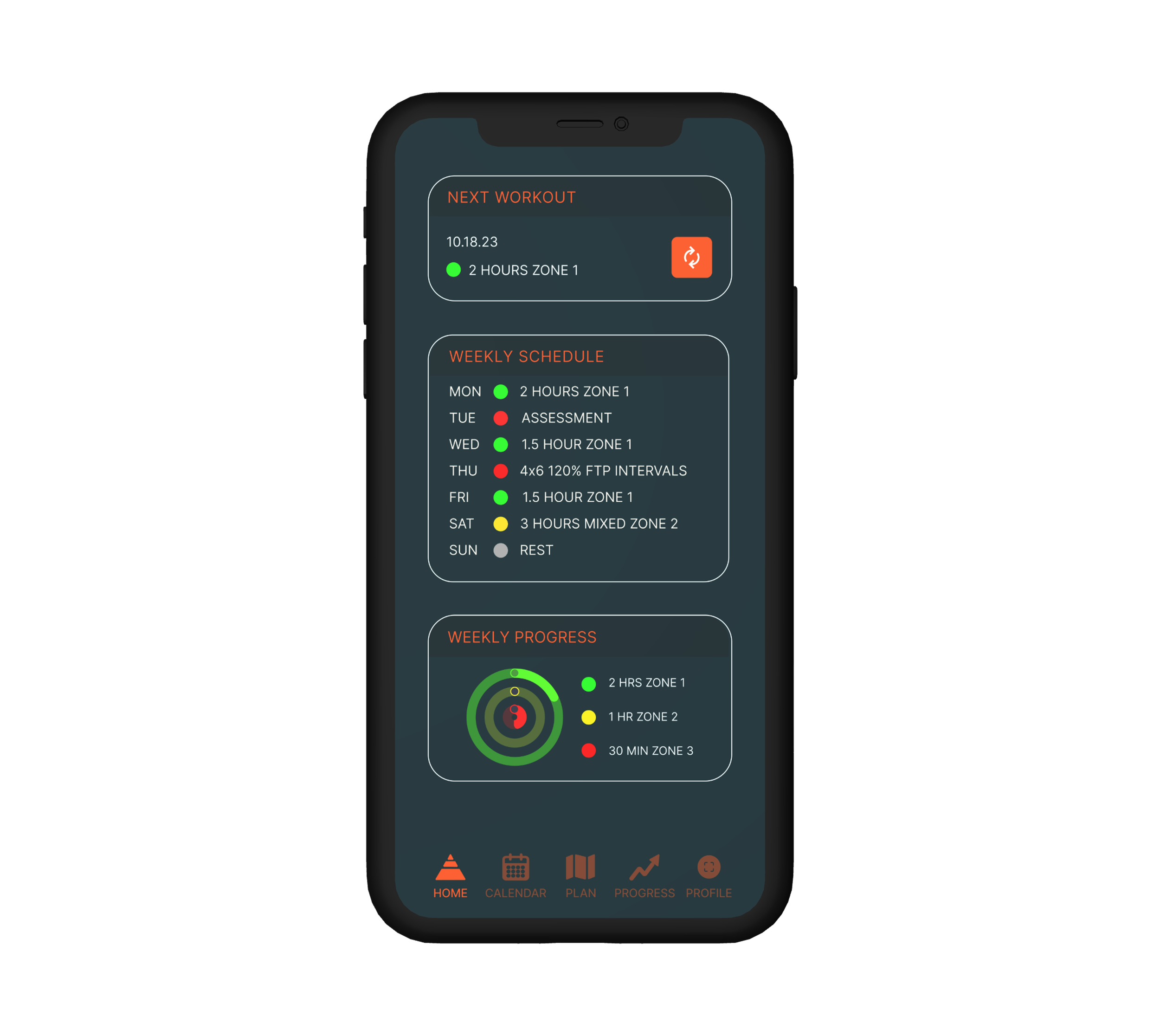
Bringing everything together
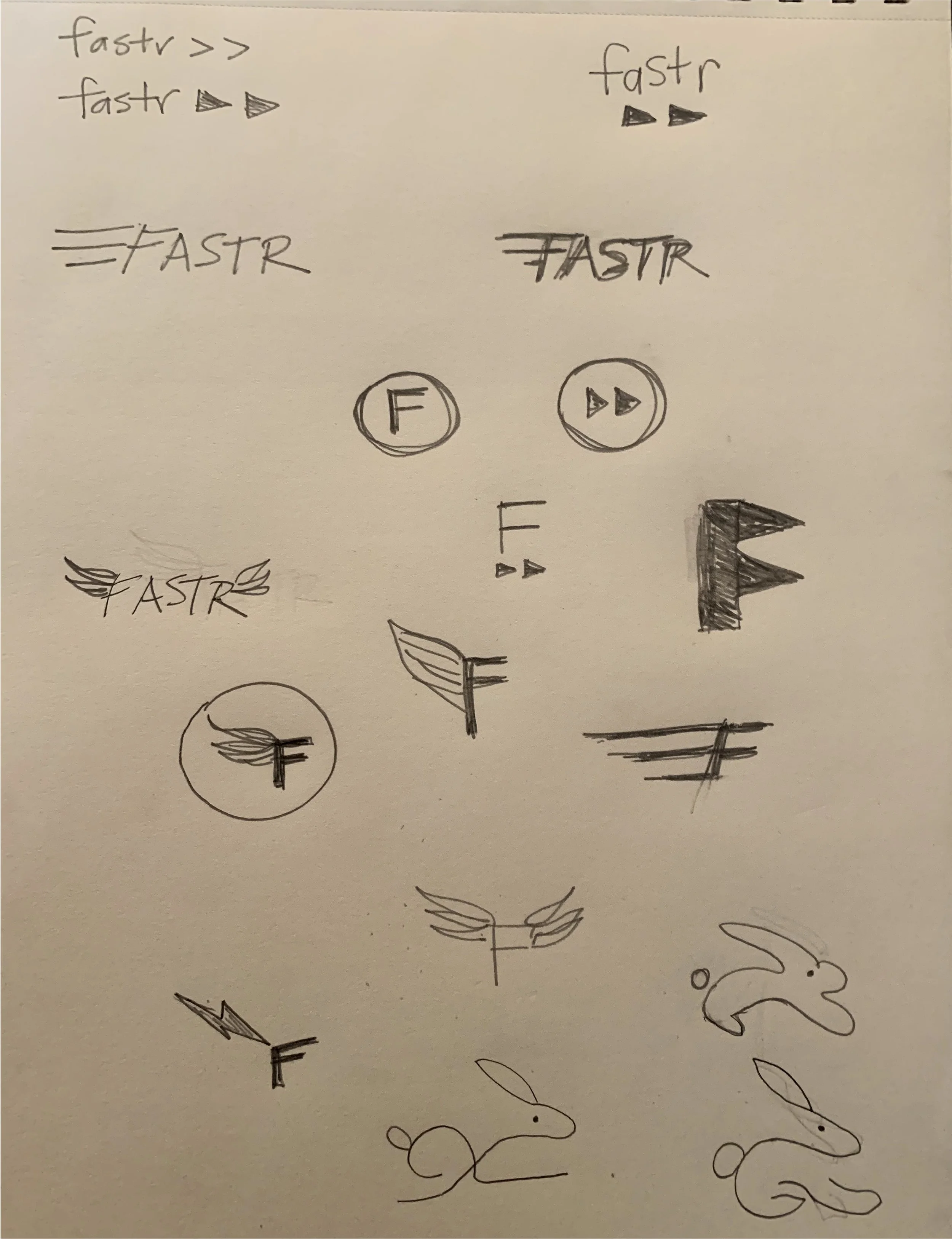
In the design phase, I was able to take my ideas and concepts and start building the product. I started with low fidelity wireframes to conceptualize the basic layout and features. Details and more content were added to the mid fidelity wireframes to further develop the structure and functionality. The final step of the design phase was the creation of a working prototype which included polished graphics and a cohesive, user-friendly design that was both beautiful and functional. I struggled a bit coming up with the right type of graphics to visually represent progress, but the user testing feedback was overwhelmingly positive.


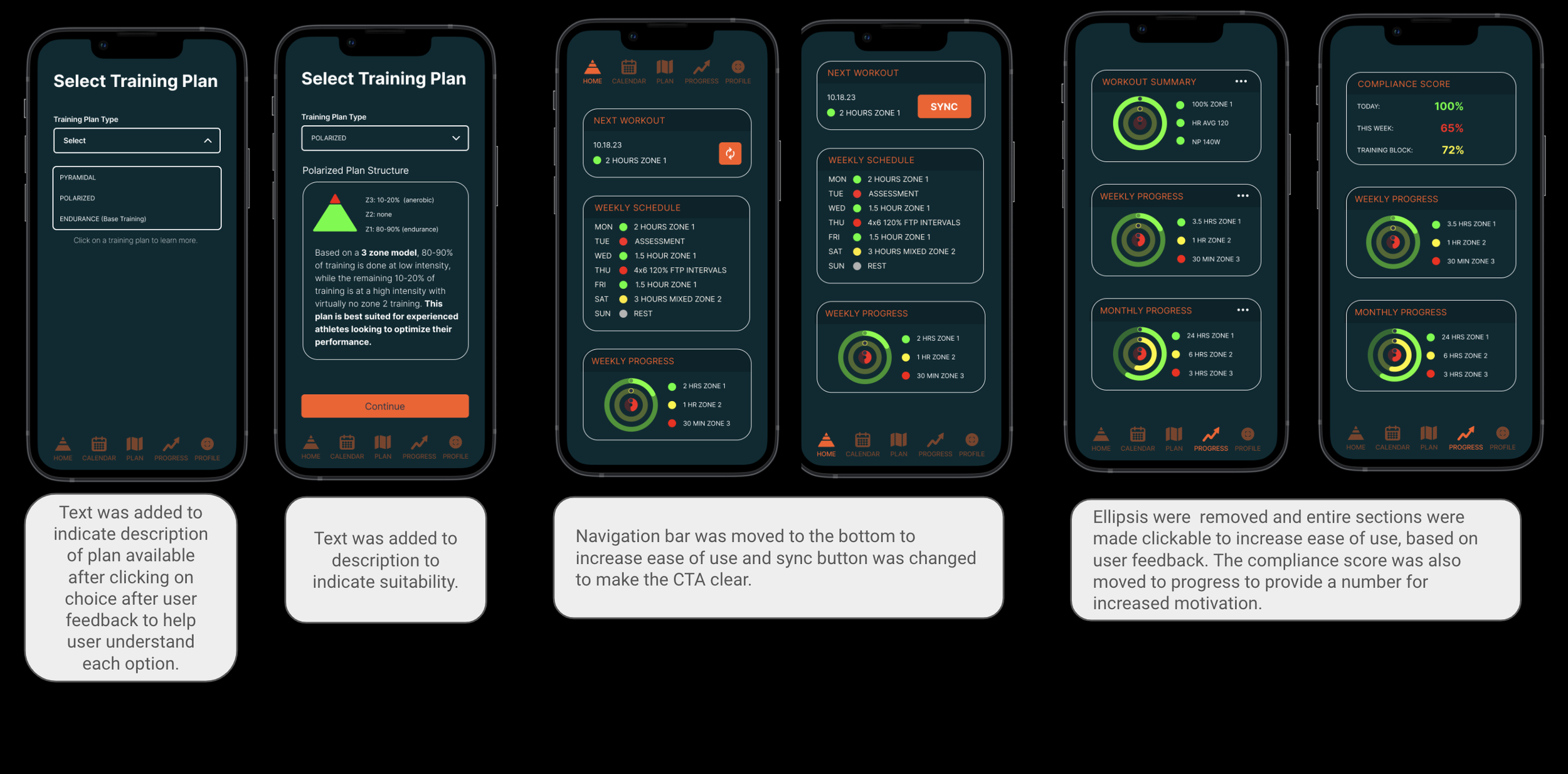
I did make a few changes based user feedback, including adding descriptive text to the Plan details, moving the navigation bar down to the bottom to increase ease of use, and the sync button was changed to make the CTA clear. Ellipsis were removed and entire sections were made clickable to increase ease of use, based on user feedback. The compliance score was also moved to progress to provide a number for increased motivation.
Iterations
Moving Forward
With polarized training gaining in popularity, this app has enormous potential.
Add lactate monitoring once technology is readily available.
Incorporate advanced adaptability algorithm to use biohacking to continuously modify recommendations.
Improve graphics to make data and metrics more accessible to all users.
Companion app
These are just some of the ideas I would like to expand on as I continue to work on this project.